The $$$ are in the details
Often its the little overlooked interactions that provide the biggest benefits. Over the past 5 years the internal search engine has been tweaked, tuned, tested. We've implemented search ahead, predictive text and ultimately swapped for a very expensive Oracle solution. All with varying, but albeit less than stellar results.
So how did I drive search usage from 15% to 27% overnight and drive over $1m annually in sales increase?
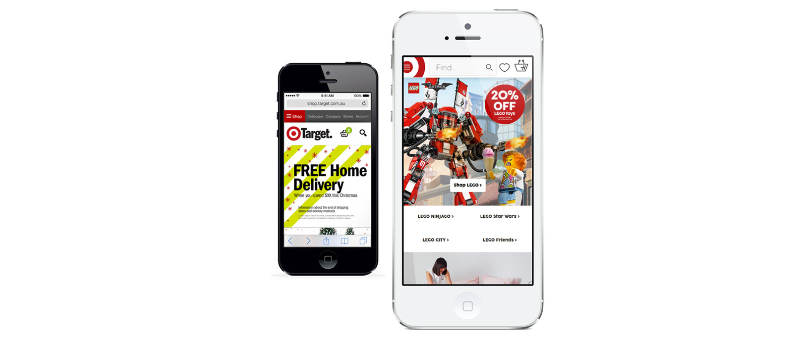
Simple, I started breaking down data around search inside Google Analytics. What I found was that search usage was lowest on mobile devices, which was not expected behaviour. Quick user testing confirmed the behaviour and solution. Which was very simple - changing the search input box within the header, from requiring user interaction to reveal, to being always visible. At the same time we made the search input box the major focus of the header on the desktop viewport and saw the homepage bounce rates drop from 18% to 8% immediately. Fast forward to today and these changes are still live (with iterations) and driving significant benefit

Test to success
I implemented a CRO program and testing capability within the UX function at Target. One of the small tests we were interested to understand was the implications of language across the site. A test was set live with multiple variations to the word "Search" in the search input box in the header. We settled on "Find" after it proved $0.12 per session improvement. This worked out to be a $647k sales improvement over 4 months.

View Case Studies
Say Hello
Thank you, your message has been sent.


