Redesign - With the growing use of mobile devices, it was seen as an opportunity to improve the user experience and also move to a responsive front end for Quiksilver's ecommerce platform.
Homepage
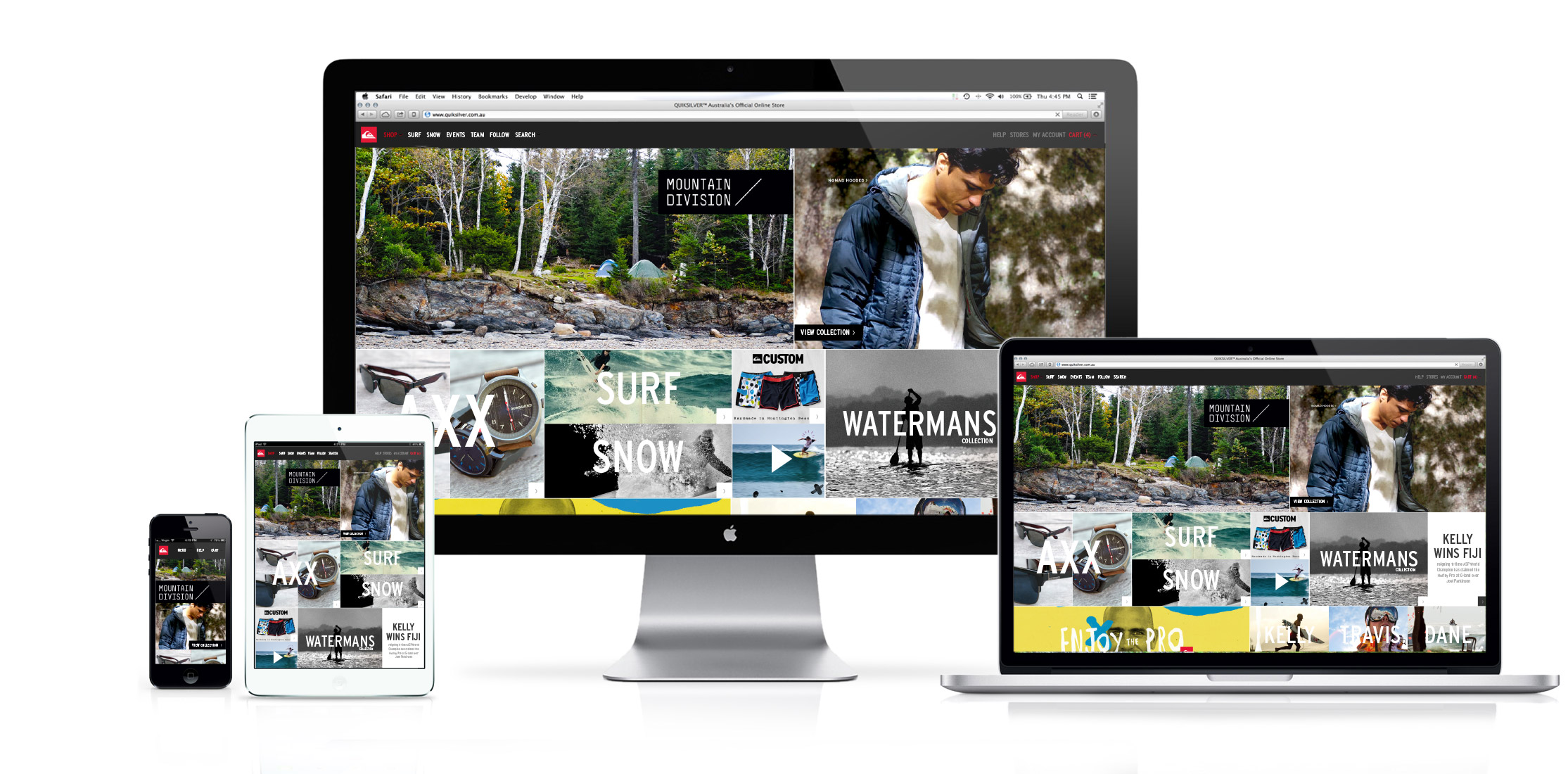
For Quiksilver, visual engagement and story telling is priority. The homepage was designed as a showcase of the best of the companies offering at an given period in time. Content feeds across Product, Events, Social, Blogs was aggregated into timeline and displayed totally integrated. Strong use of full screen of all devices with scaling content was used to provide an immersive presence.
Category Pages
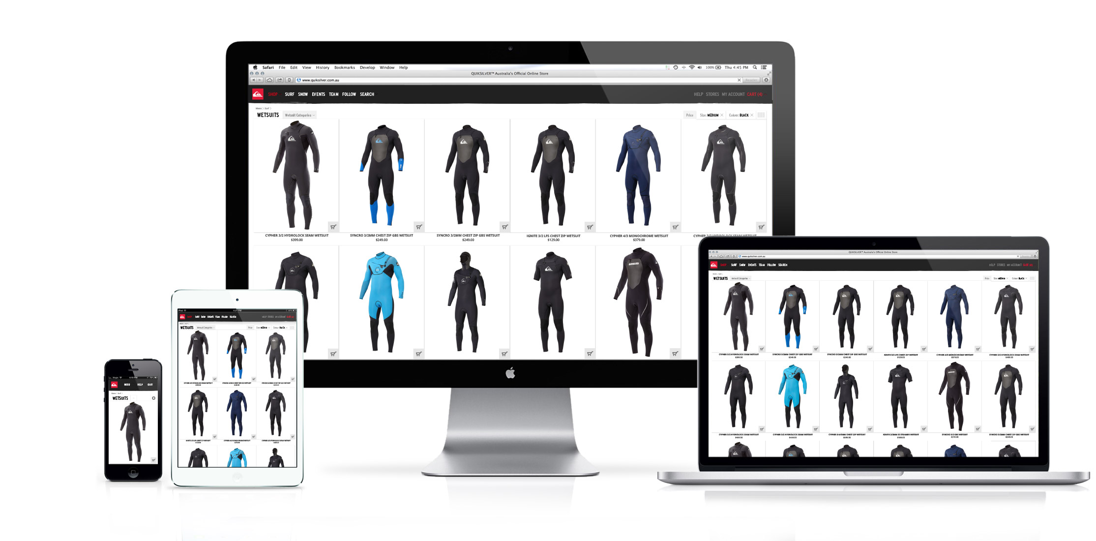
Once into the discovery journey, Quiksilver's, customers were found to shop heavily by image, resorting to navigation and facets only when required. Thus using those devices in an "accessible when required" method allowed the product to become the hero and for a unique category page format to be developed. Creating a beautiful yet functional cross device shopping experience.
Product Pages
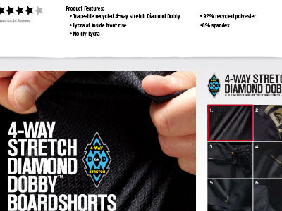
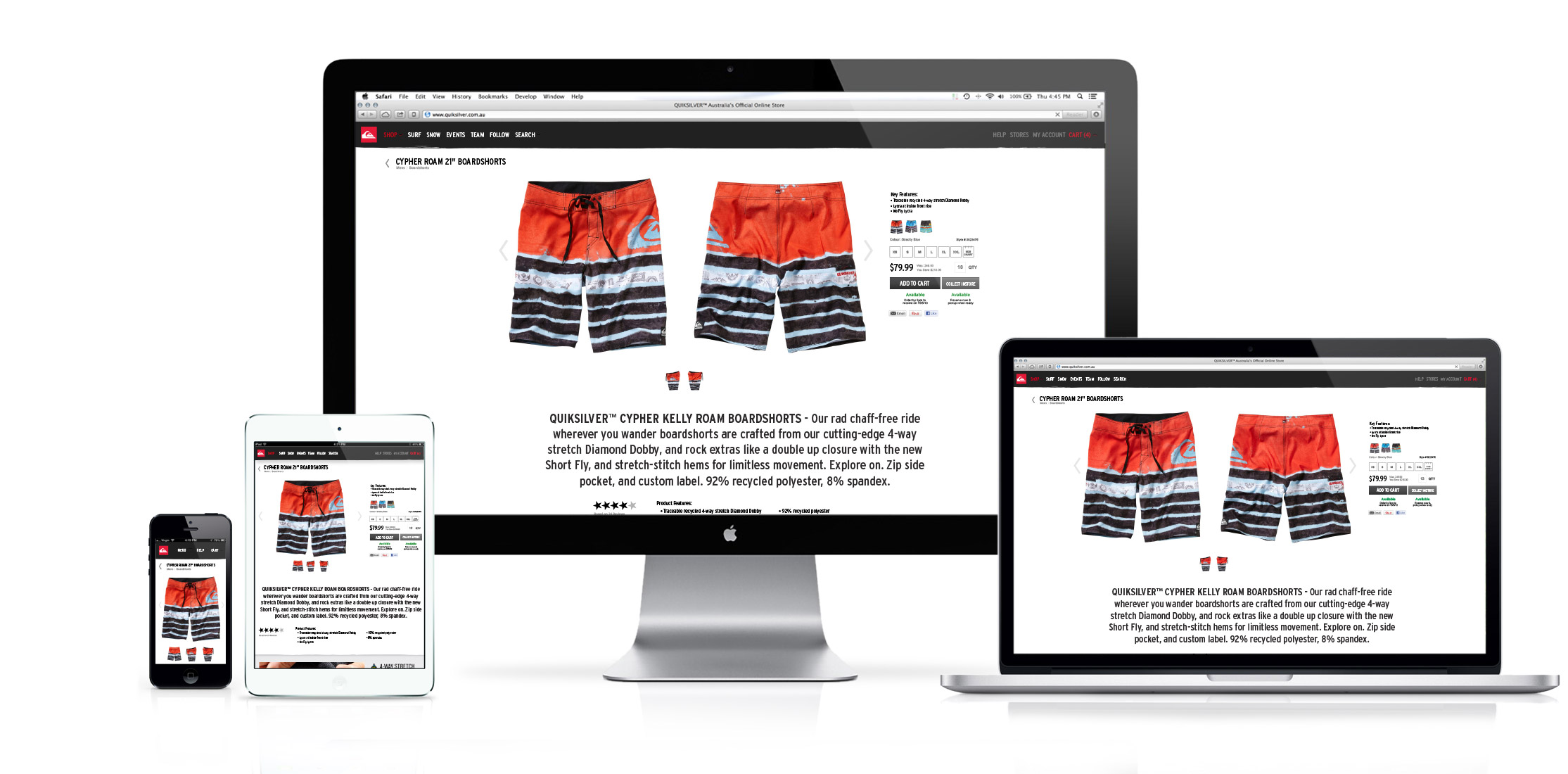
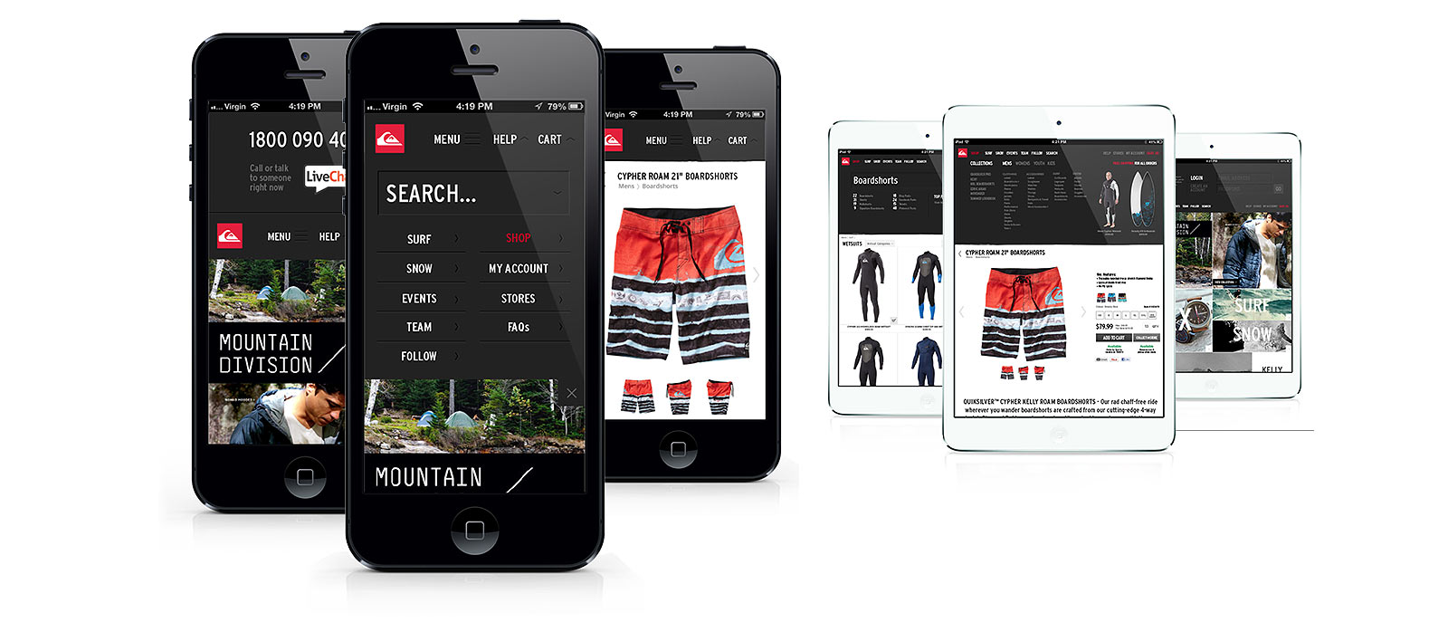
Following on with the "let the product sell itself" mindset. Product pages are dominated by the product in a spacious and free flowing layout. Use of front and back image visible on load where screen size permits, large font sized descriptions and ratings plus simplified purchasing options really move each and every product page into landing page territory. Giving the product the best chance to sell itself.
Menus
Function is key for all ecommerce sites. So I was particularly mindful of how users will interact with navigation - especially in responsive formats. Keeping critical information visible or under logical callouts, such as a "help" menu which pushes down to revel Live Chat or a large phone number. Like wise keeping a mobile header simple, while surfacing all the subsequent drop down categories on larger viewports crucial.
-
Full Homepage
-
Full Product Page
-
Mobile/Tablet
View Case Studies
Say Hello
Thank you, your message has been sent.

