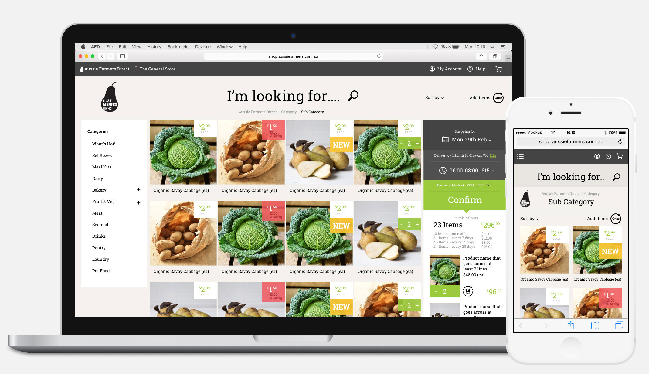
Coming into Aussie Farmers Direct, I was tasked to develop their UX Strategy in the face of difficult legacy systems and a digital transformation project as part of a wider company direction reset. During my time the company went through multiple brand strategy direction changes, but despite this the UX direction within 1 App Architecture and design style were delivered and are still driving success for Aussie Farmers Direct today.
Discovery
Working with Key stakeholders across the business to determine requirement sets. Working with Technical leads on determining the Technical Architecture and its implications for the future UX strategy. Building out the customer journey, and experience flows so that the project could achieve sign off and begin.
Wireframes & Prototyping
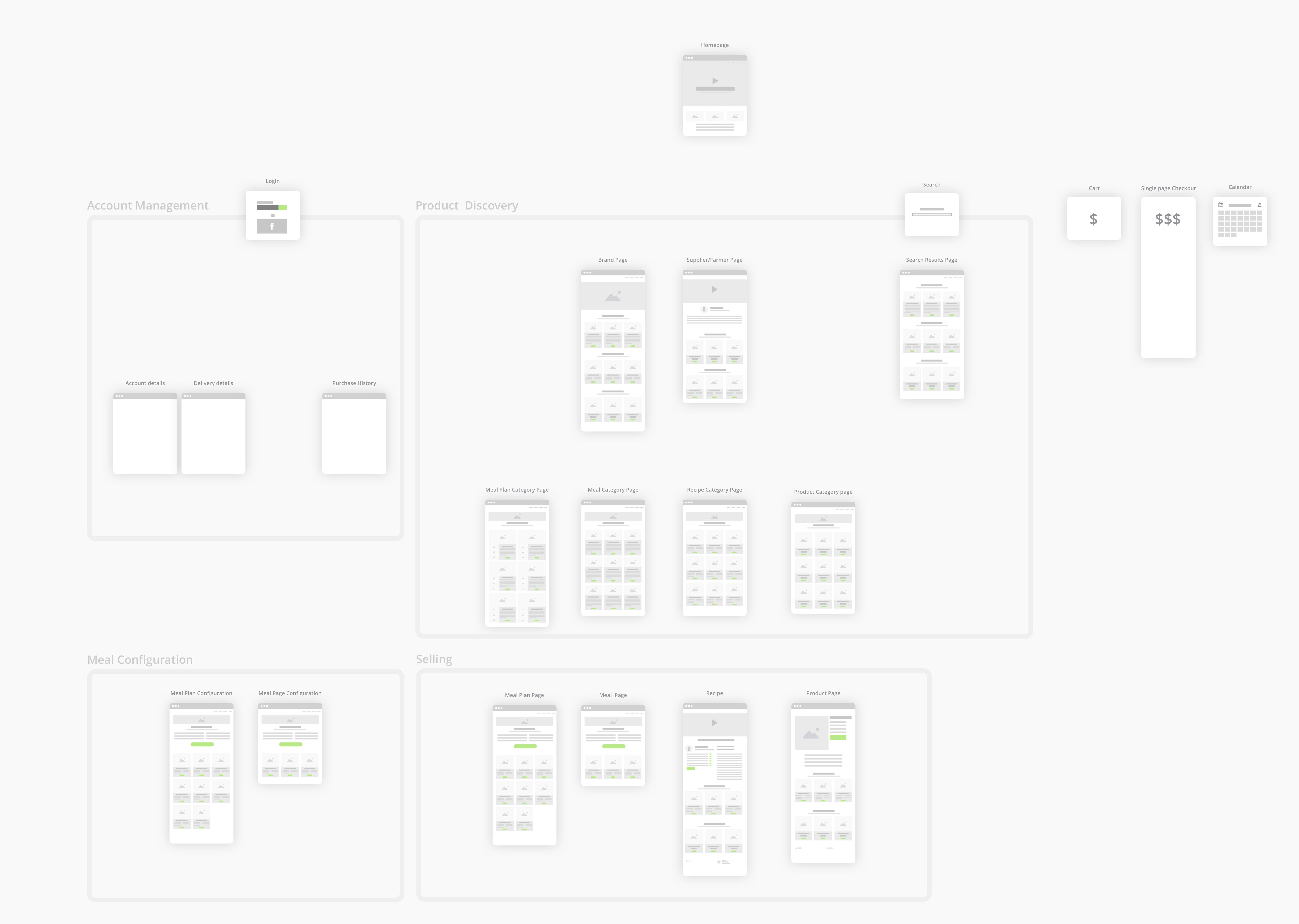
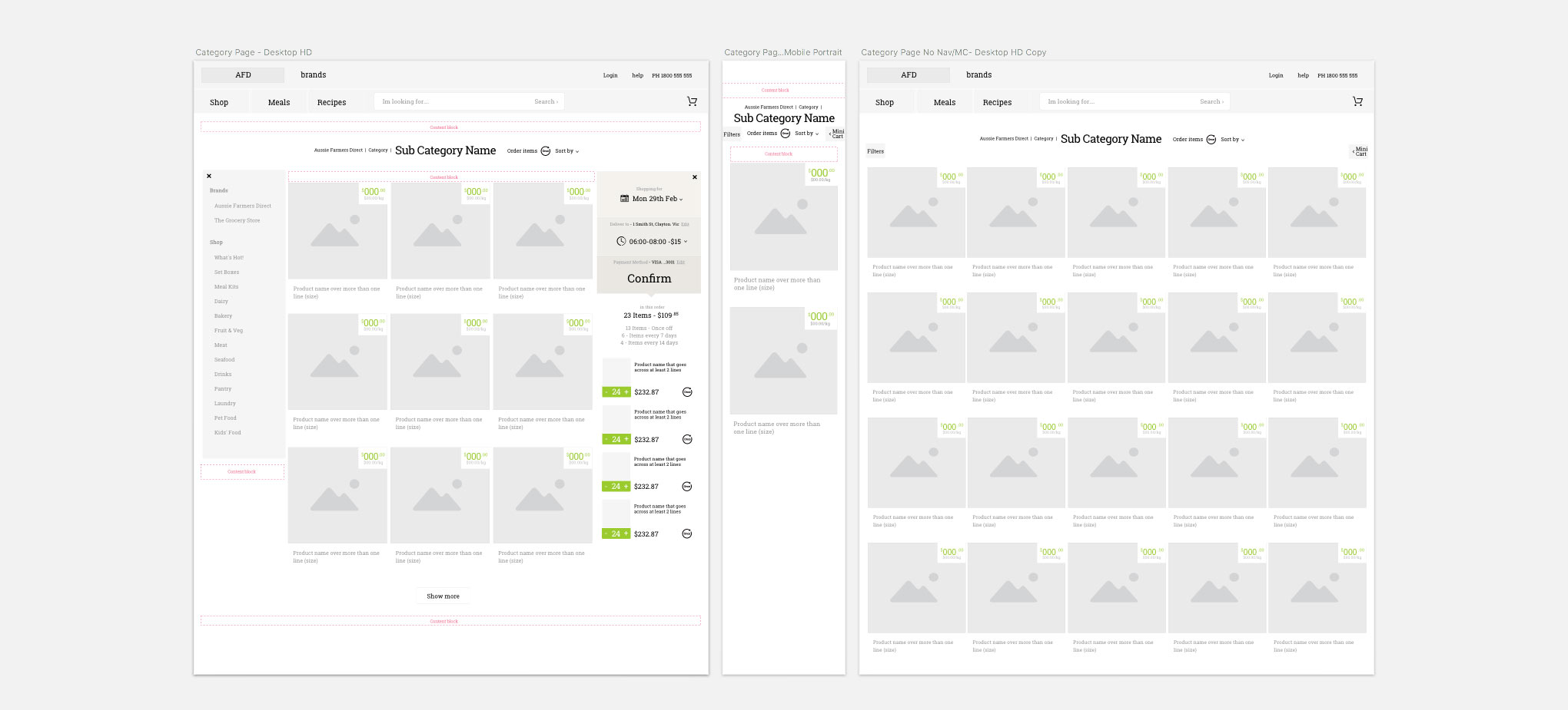
Working within a 1 App framework for a fresh food company with views to create a marketplace, combining complexities of subscription ordering, localised content all within a mobile first implementation - was challenging. Fast and iterative wire framing was imperative to build confidence and solidify direction.
UI Kit
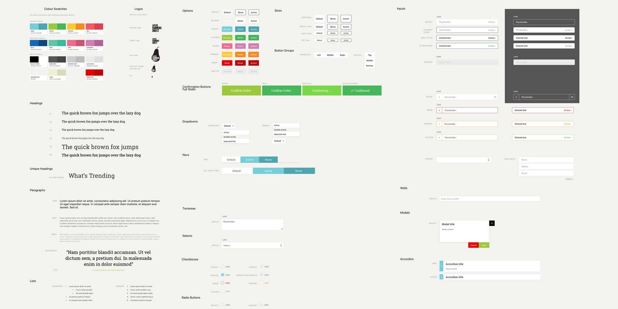
Delivering a UI Kit on brand and early into the project allowed for a faster & less complex project.
Accounts
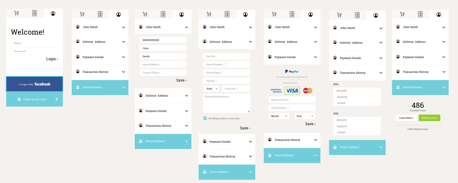
The new AFD site included an accounts, shopping list and checkout area visually combined into a "toolkit". Given the complexity of the ensuing build for development - this was tackled early in the project. Below is early direction showing the accounts section.
Deliveries
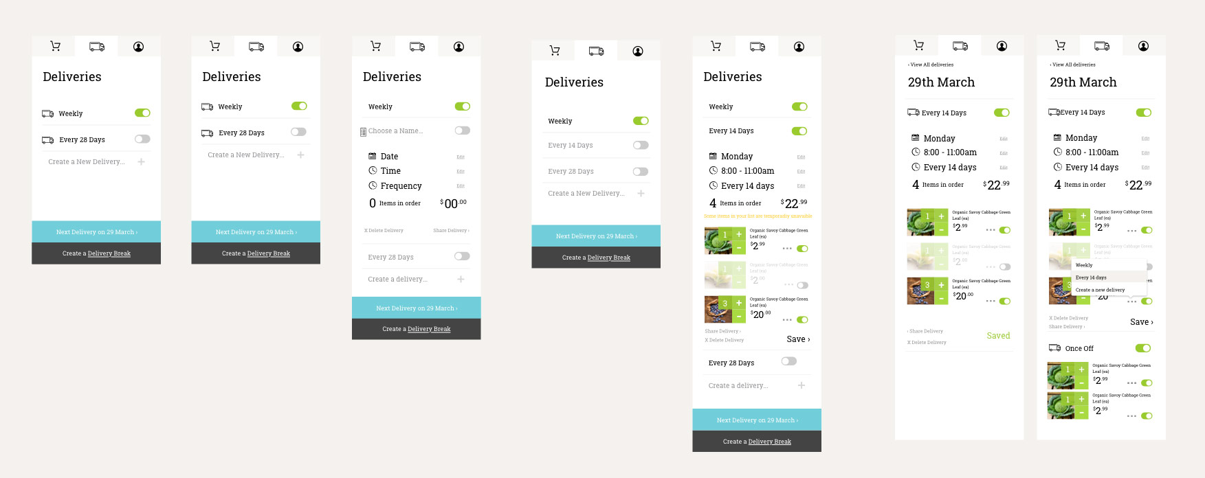
Another area of complexity was scheduled deliveries. Below screens showcase early direction before prototyping and user testing.
Product cards
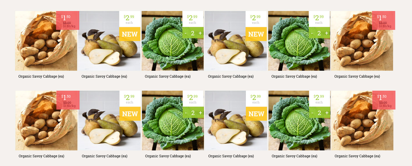
High definition renders of a variety of product cards.
View Case Studies
Say Hello
Thank you, your message has been sent.


