First time ecommerce
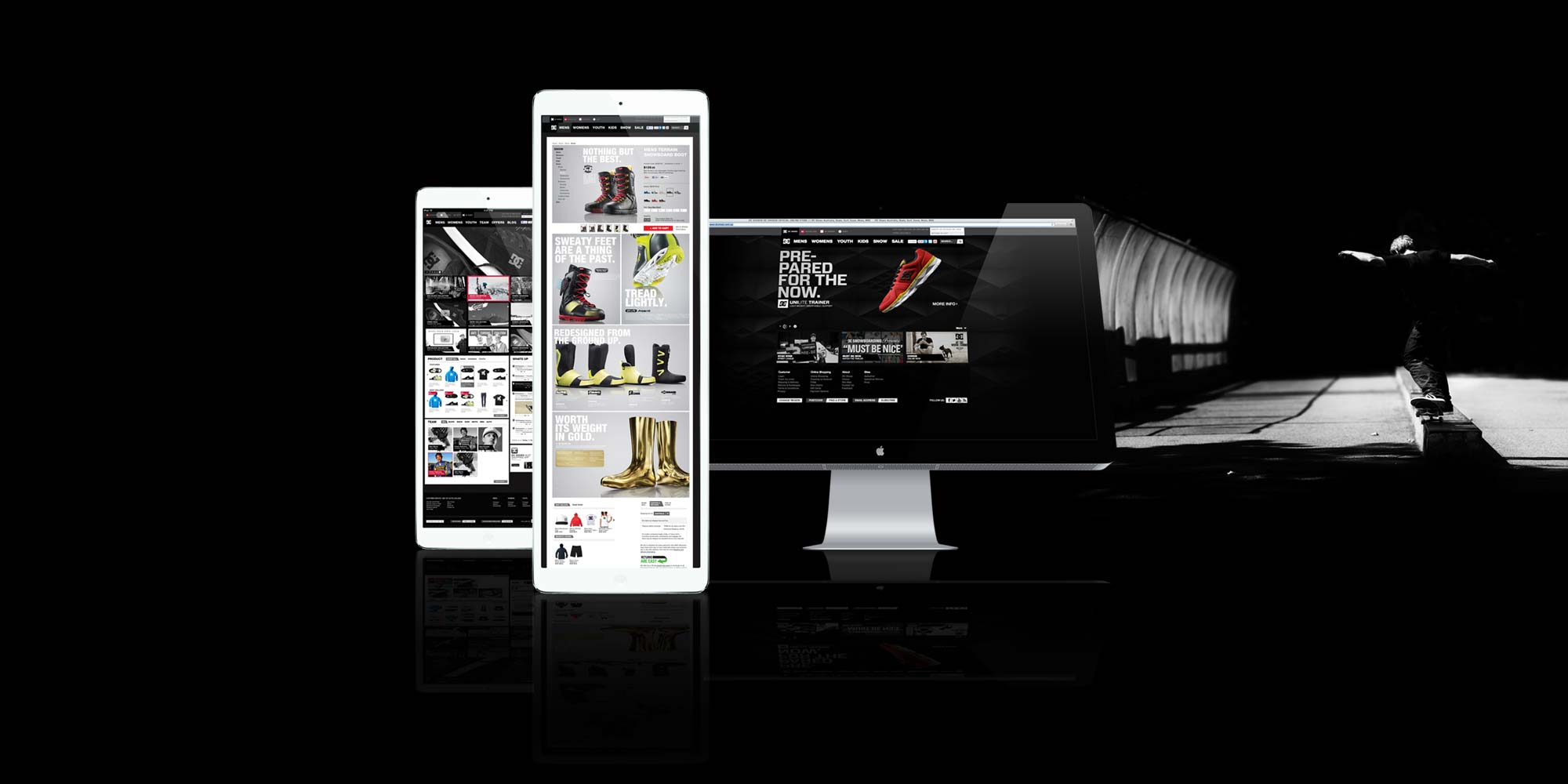
Launching into ecommerce for DC Shoes was always going to be a little tricky for a brand that is so heavily driven on an anti establishment mindset. While the consumer wants the product, its the core values of the brand that really drives purchasing behaviour. The redesign needed to be a slick, with ecommerce sitting behind a very strong brand presence.
-
Custom Signup Forms
-
Banner Design
-
Its the little details
Rich User Experience
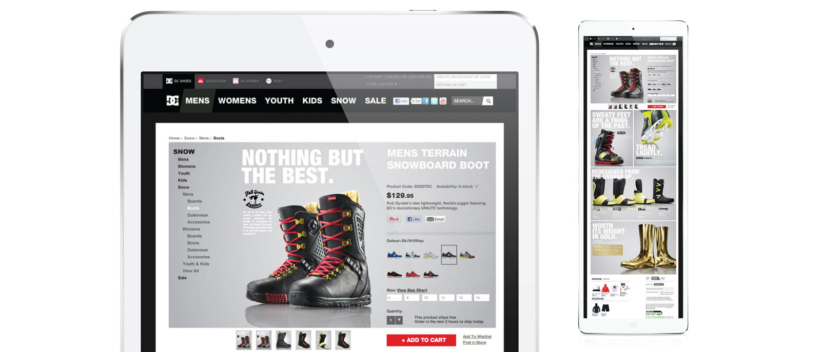
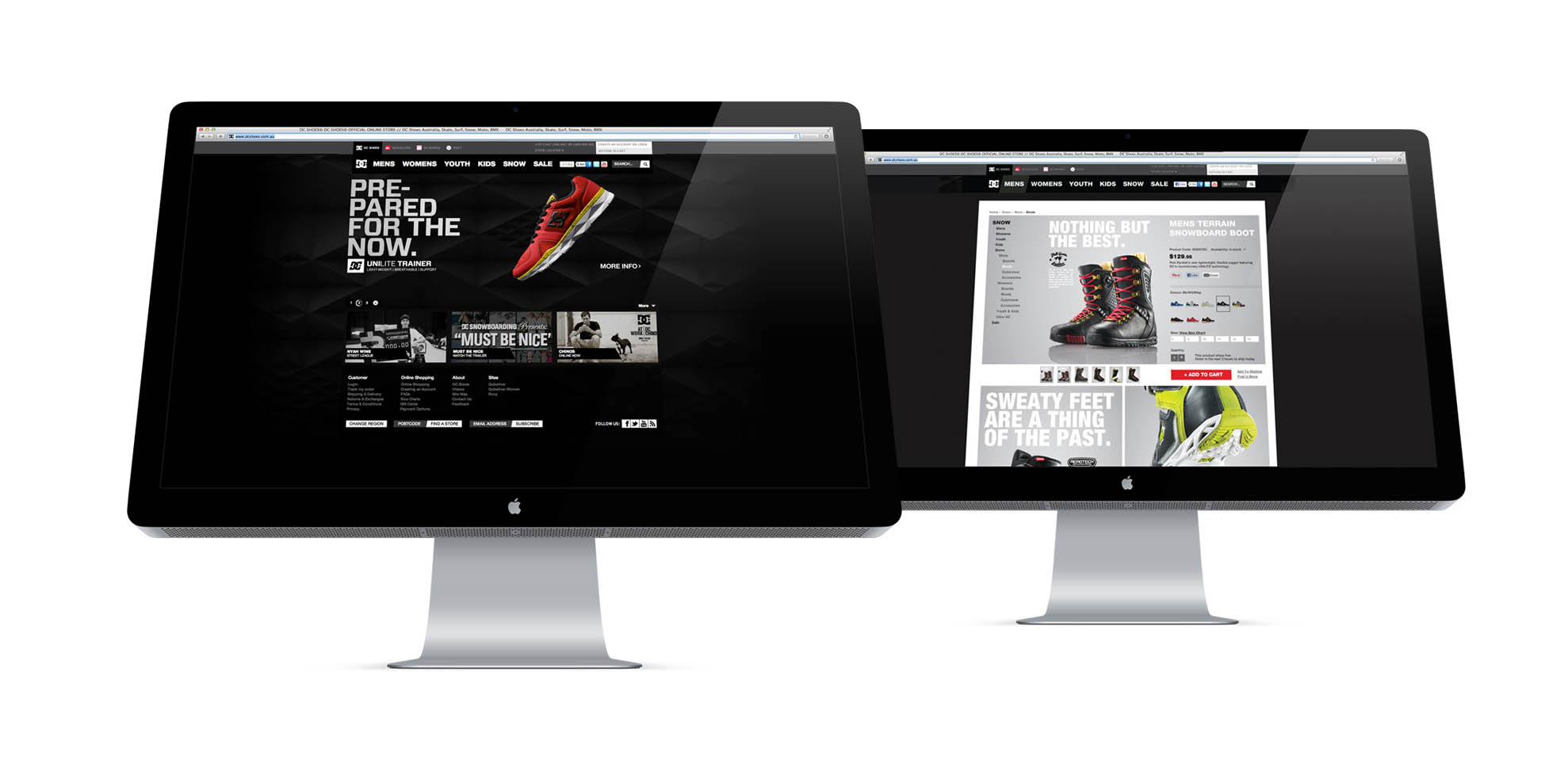
Balancing a content heavy brand focus with clever UX lead to extremely engaging executions. Product pages that allowed for seasonal products to carry image rich content while keeping the Add to Cart process as the primary focus, were key to engaging customers and driving sales.
Built on Magento
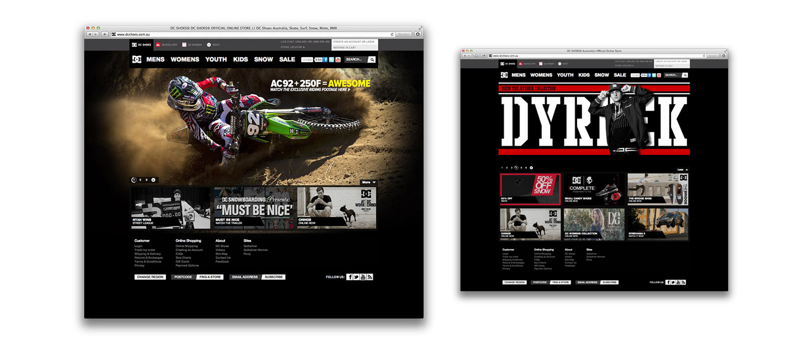
When building on Magento, designing a UI that is different yet still functional is key to standing out in the crowd of sameness. dcshoes.com.au combined a beautiful banner & tile system that simplified the user interactions while maximising adaptability for campaign design. The website also cleverly aligned with other sites from the companies other brands - quiksilver.com.au and roxyaustralia.com.au by sharing the shopping cart across the sites and using a custom header to visualise this to customers.
Lead Design
While working for Quiksilver, parent company of DC Shoes, I worked as Lead Design in the ecommerce dept. This multifaceted role saw me working across the companies stable of brands leading the ecommerce store front redesigns.
Team Management
During this time I recruited, mentored and managed a team of high performing digital designers. Training them in the Magento CMS, Mailchimp system and also entrenching them into the Business processes and procedures. This created highly effective digital team members who contributed far greater than traditional banner builders
Core Responsibilities
- Management of all ecommerce communication and creative assets.
- Design & execute User Interface
- Management & Production of the EDM channel
- Develop visual components that enhance the website
- Developed a digital asset production procedure
View Case Studies
Say Hello
Thank you, your message has been sent.
